horizons support network
January 2026
brand identity & website refresh
Horizons is a fast-evolving Brisbane-based support network centred on human character and genuinely human care.
Disability support branding often leans clinical, corporate, or emotionally distant. Horizons stood apart in practice, but not yet in presentation.
The challenge was to:
Create a brand that felt warm, optimistic, and people-first
Build trust with families while remaining friendly and accessible
Develop a system that could grow and adapt without losing clarity or character
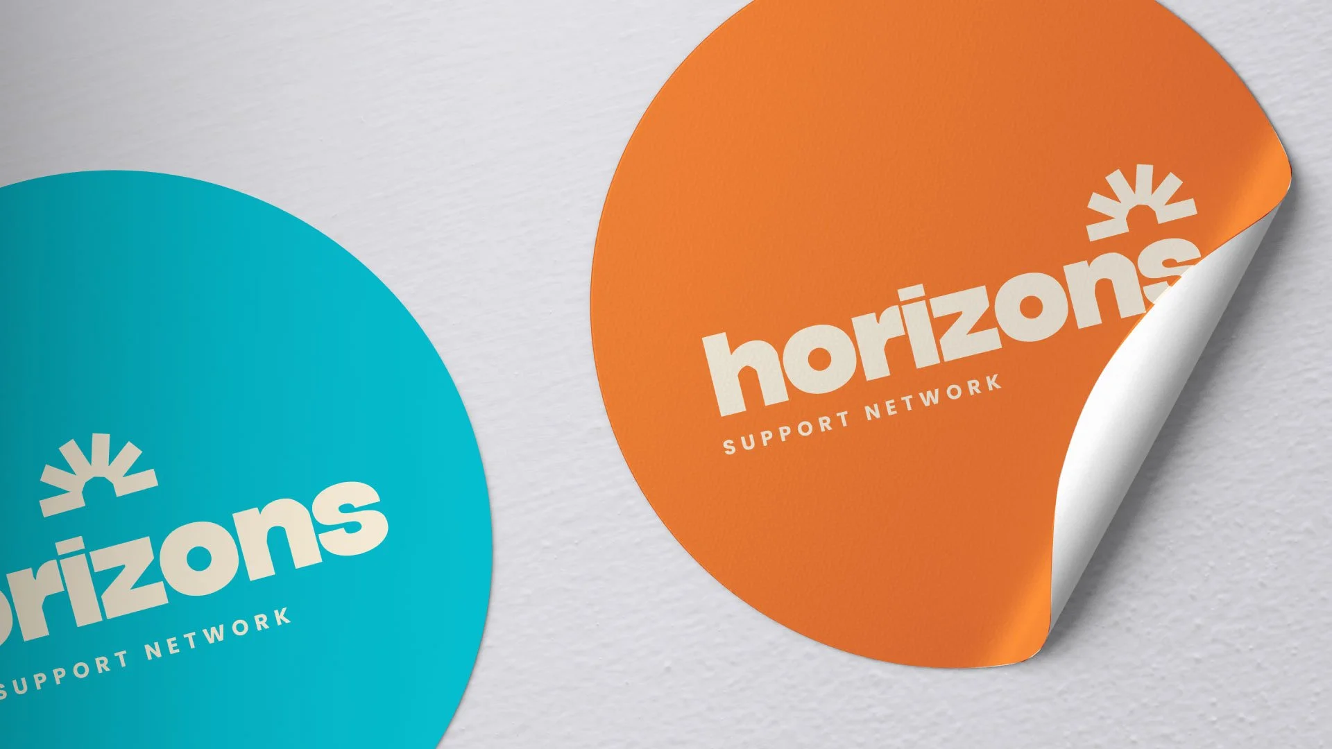
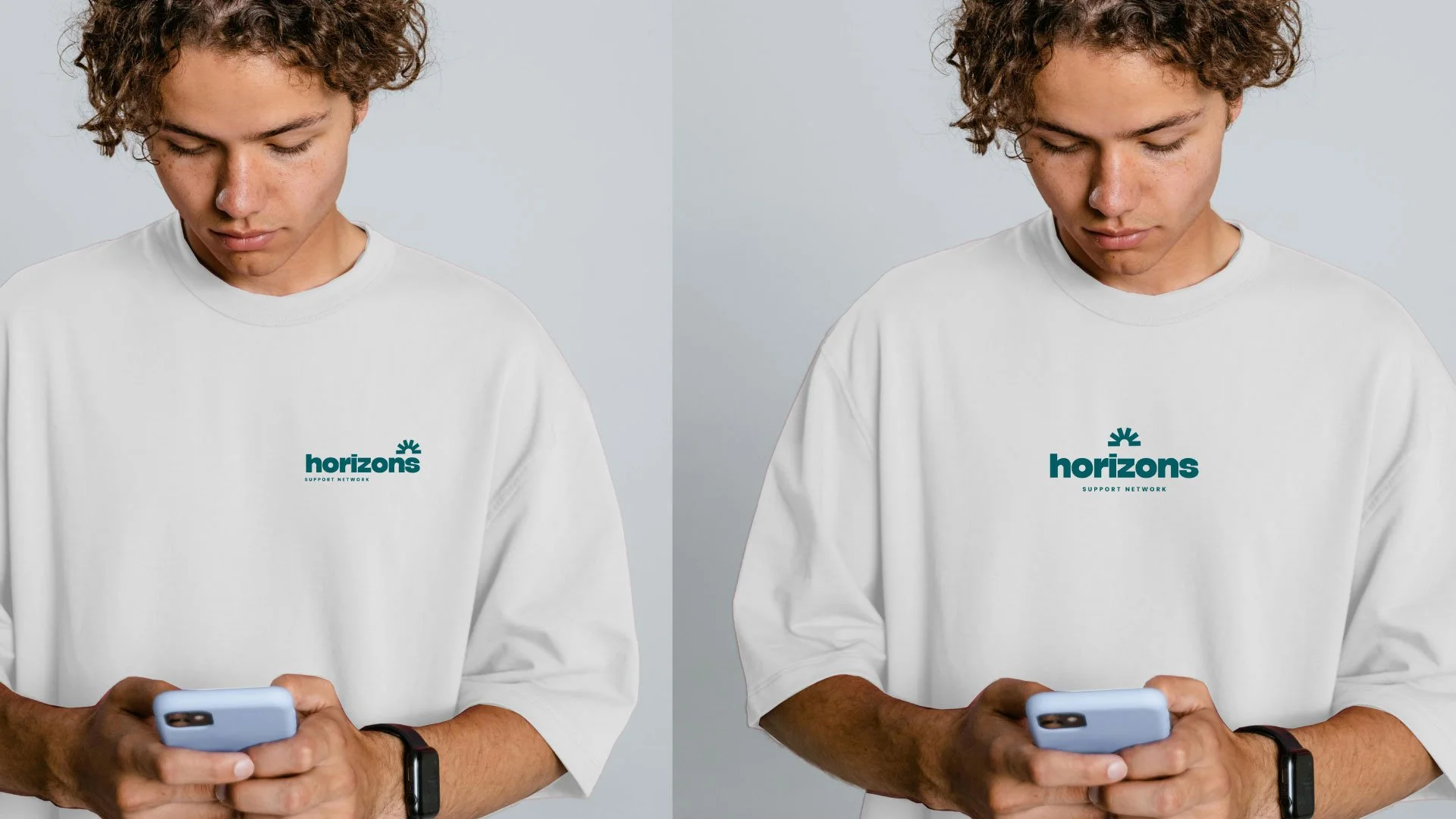
Brand system
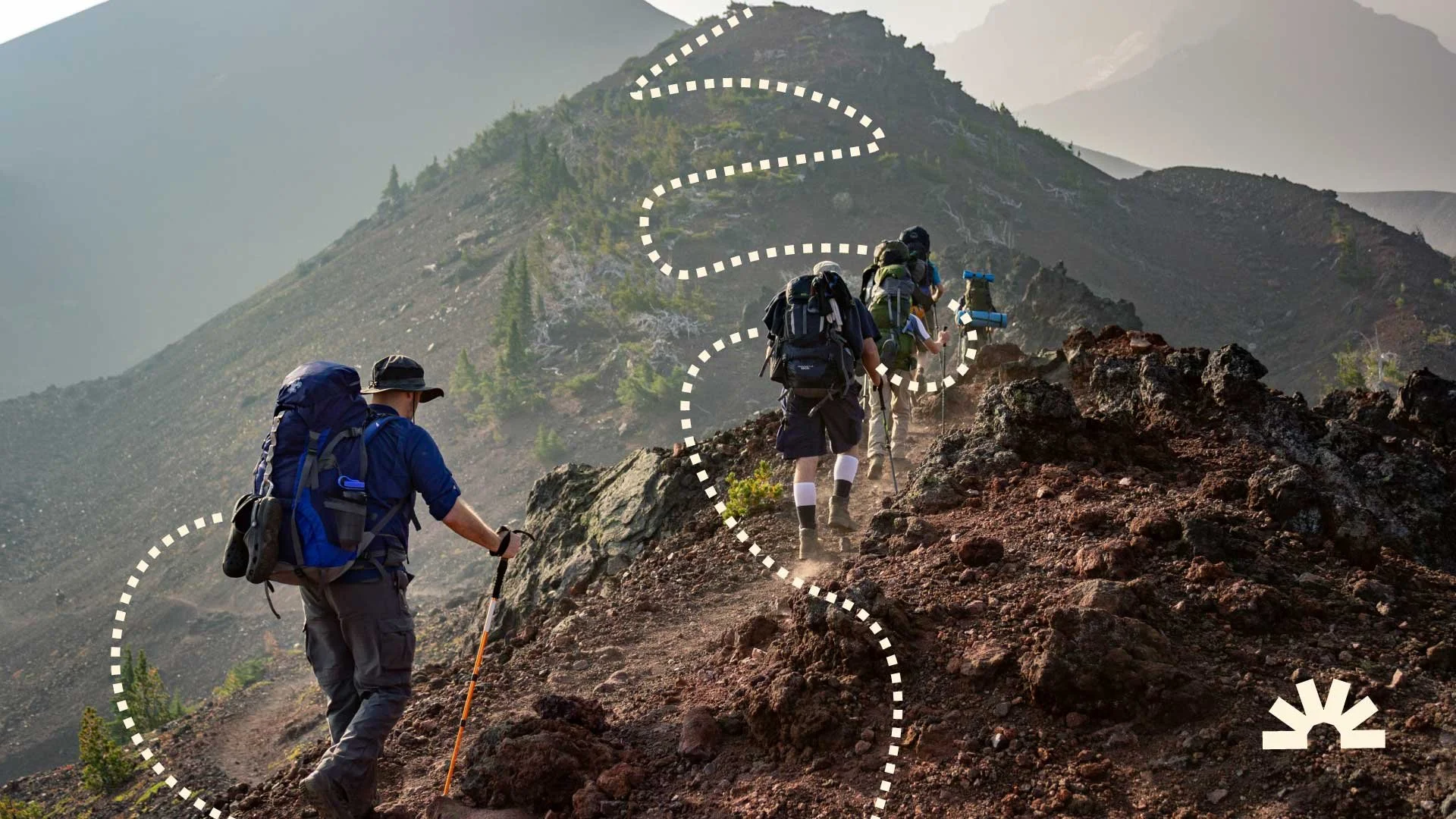
The system is built around a simple but distinctive visual language. At the core is a custom linework style, used across layouts, apparel, and digital touchpoints. It creates movement, energy, and a sense of connection - giving the brand something ownable beyond just a logo. This becomes a consistent thread across everything Horizons produces.
The colour palette was designed to feel approachable and optimistic, while still being practical in real use. Tones were selected not just for personality, but for contrast and accessibility — ensuring readability across web, print, and day-to-day materials.