
Founder Portfolio · Brand Identity
Byblós.
A brand refresh for a beloved Lebanese venue at Portside Wharf — modernising the identity while reconnecting the experience to its Phoenician roots.
Byblós, Portside Wharf
Marketing Executive, Ghanem Group
Lead designer on the project.Brand refresh, identity system, typography, campaign collateral and creative rollout
The brief
Respect the original. Reframe the experience.
Byblós already had recognition, history and emotional connection. The task was not to replace the venue’s identity, but to refine it — keeping the original mark while giving the brand a more polished, premium and culturally grounded expression.
The new direction brought the brand closer to its Phoenician roots, introducing hand-drawn effect figures, eclectic motifs and a cleaner design system that could carry across menus, campaign assets, digital touchpoints and the venue experience.
Identity system
A cleaner mark with deeper character.
The original Byblós mark remained at the centre of the refresh, but the surrounding system was modernised: stronger typographic hierarchy, more confident spacing and a visual language that felt refined without losing warmth.
The result was a brand that could sit comfortably in a premium riverside dining context while still feeling unmistakably connected to Lebanese hospitality and Phoenician visual cues.
Visual language
Phoenician-inspired details, redrawn for today.
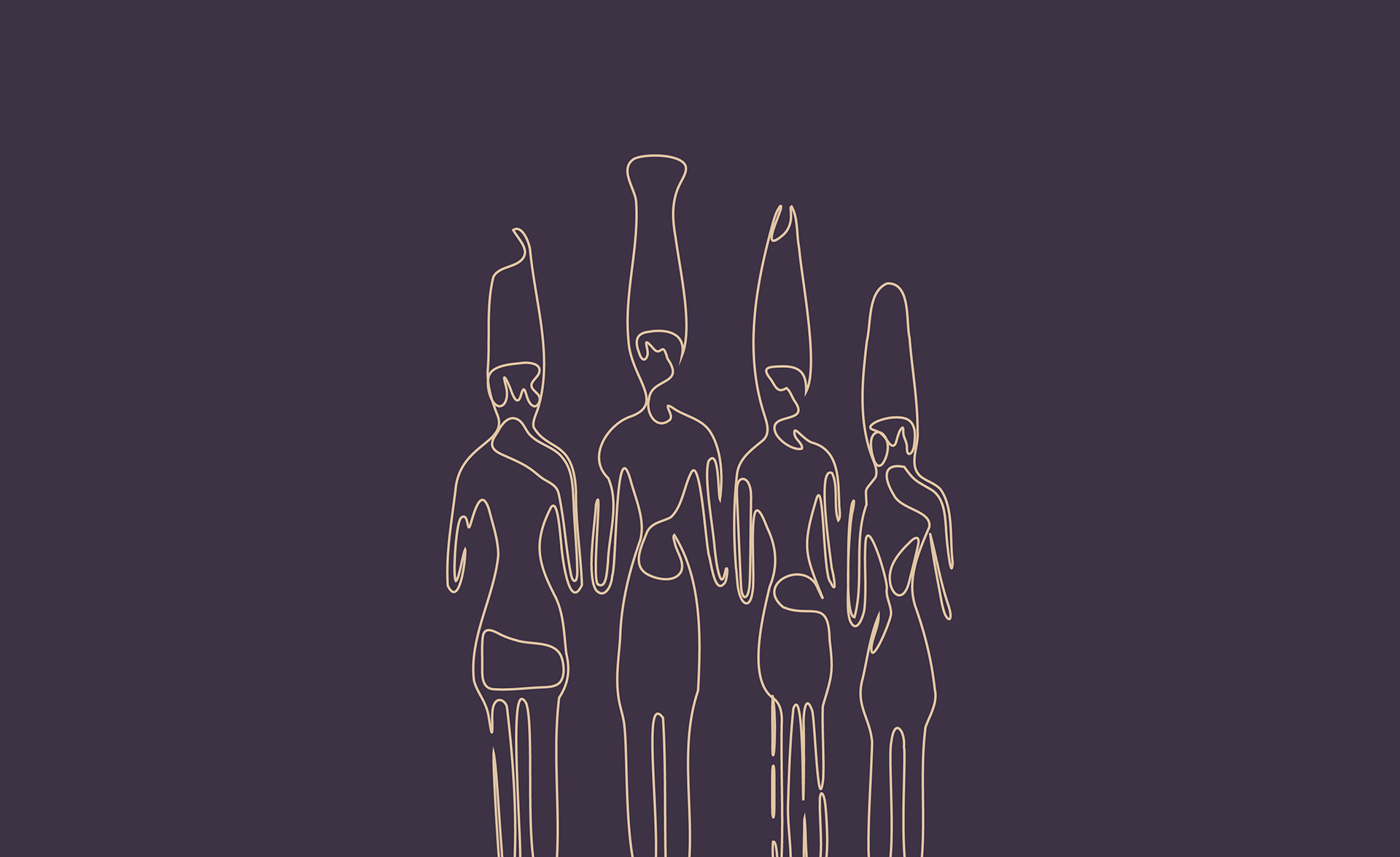
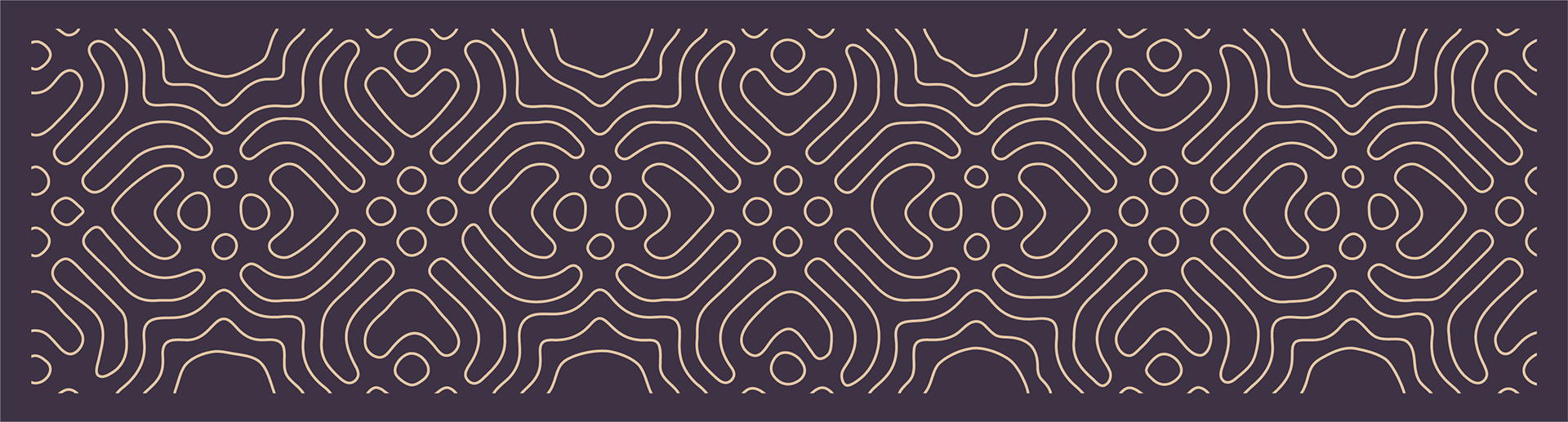
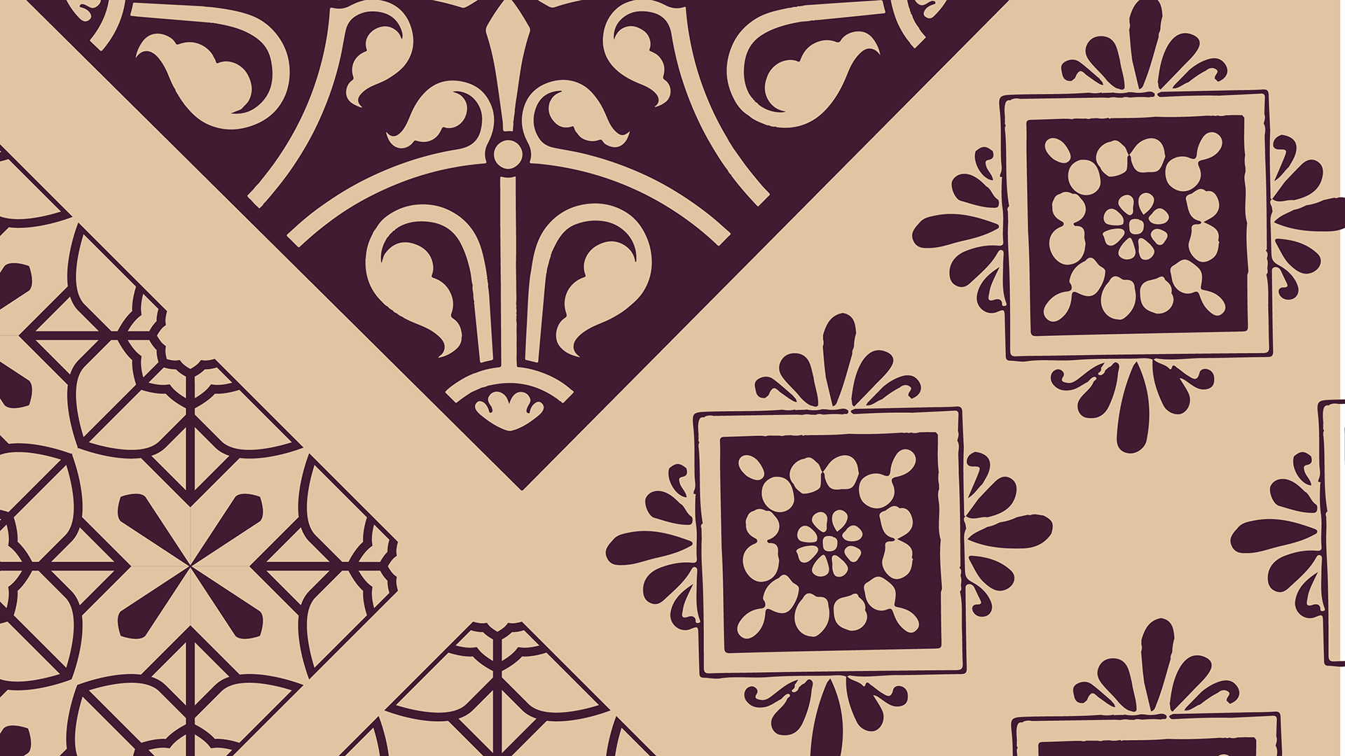
Hand-drawn effect figures became the hero of the brand system, supported by a wider collection of motifs and pattern work. These elements added texture, culture and depth without making the identity feel heavy or traditional.
The system was intentionally restrained: expressive enough to feel distinctive, but stripped back enough to feel elegant across the venue’s new fitout and premium customer touchpoints.
Brand in use
Built to live beyond the logo.
The refreshed identity wasn't designed to live in a brand guidelines document. Every element was created as part of a flexible visual system that could be applied consistently across campaigns, menus, events and everyday venue communications.
The Phoenician-inspired illustrations became a recognisable visual device throughout the brand, giving Byblós a distinctive personality while remaining intentionally simple to work with. The result is a system that feels premium, cohesive and easy to extend without losing its character.
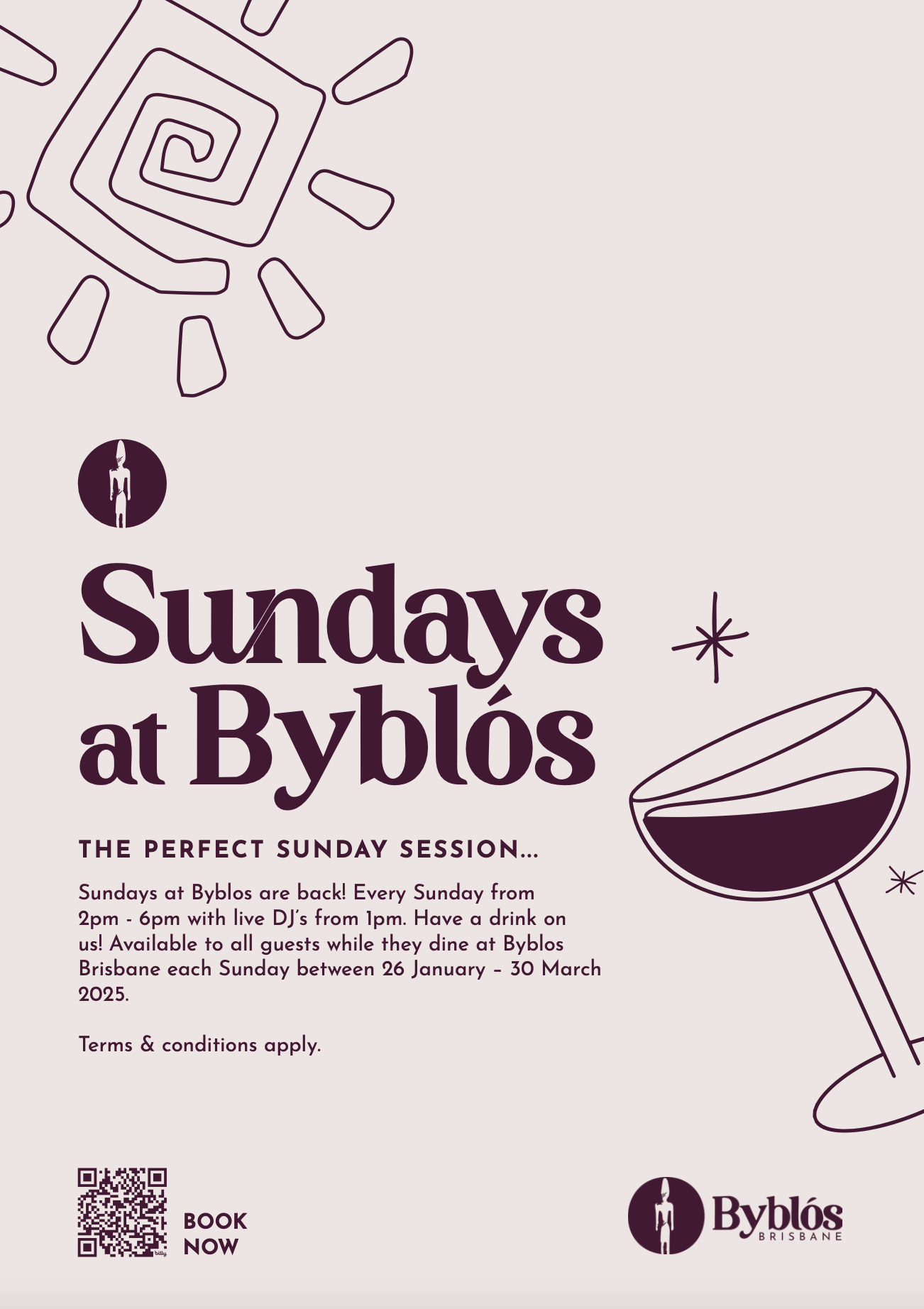
Sundays at Byblós
Weekly event artwork created using the refreshed identity system.
Rather than creating a one-off campaign style, the design draws directly from the core brand language — typography, illustration and restrained colour — allowing future designers to create fresh promotional assets while maintaining a consistent visual identity.
Colour & typography
Warm, restrained and built for a premium venue.
The refreshed palette moved the brand into a more refined hospitality space, using deep wine tones, warm neutrals and soft contrast to feel premium without becoming cold or overly minimal.
Typography was used to create a balance between heritage and modernity — expressive enough to carry the personality of the venue, but structured enough to work across menus, posters, digital assets and in-venue communications.
Deep wine, warm cream and soft neutral tones.
Elegant display type paired with clean supporting copy.
A more confident typographic system gave the brand stronger hierarchy across menu design, campaign artwork and customer-facing touchpoints.
A refreshed identity with heritage at its centre.
The Byblós refresh gave the venue a more elegant, premium and cohesive identity while preserving the recognition of the original brand. By drawing from Phoenician forms, hand-drawn details and a more restrained visual system, the brand could evolve without losing its sense of place.